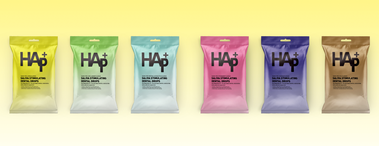

Design Approach
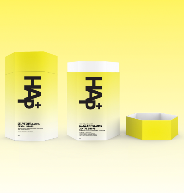
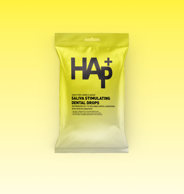
The rebrand focused on clarity, trust, and modernity. The logo was refined into a bold, minimalistic wordmark, where the strong black typography conveys reliability, while the "+" symbol emphasizes health benefits. A gradient background was introduced to create a sense of freshness, with the yellow tone for the lemon flavor reflecting the product’s citrus taste and revitalizing properties.
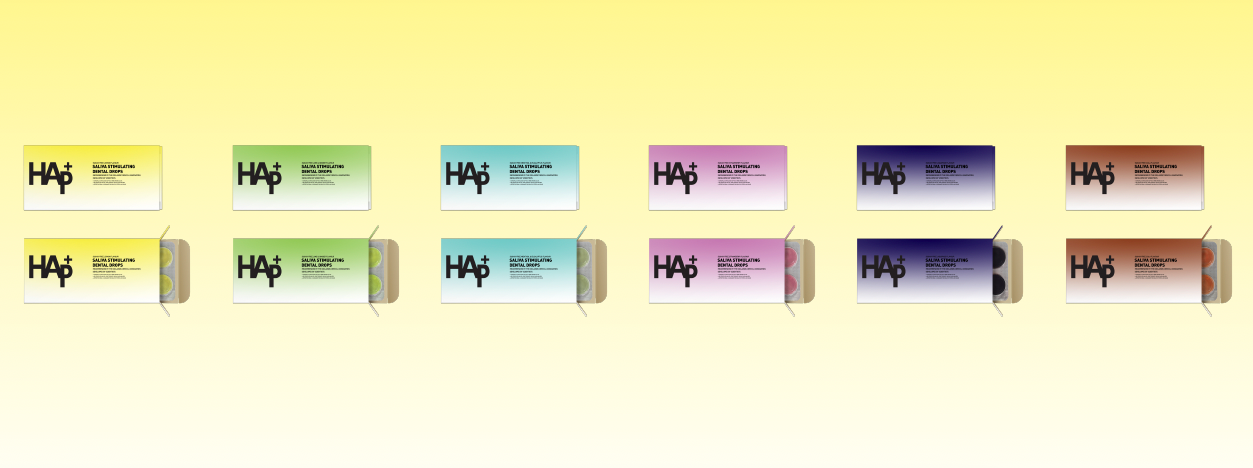
Packaging Strategy
We developed two packaging formats:
– Blister Pack Box – A sleek, pharmaceutical-style box designed for a clinical, prescription-like feel.
– Resealable Pouch – A more consumer-friendly bag for easy, on-the-go use.
To differentiate flavors, we introduced a series of pastel gradient colorways, maintaining a cohesive yet distinct identity across the product range. The clean, no-fuss design enhances visibility on the shelf while reinforcing the brand’s professional and scientific foundation.
The result is a modern, approachable, and premium rebrand that positions HAp+ as both a medically endorsed and consumer-friendly product.