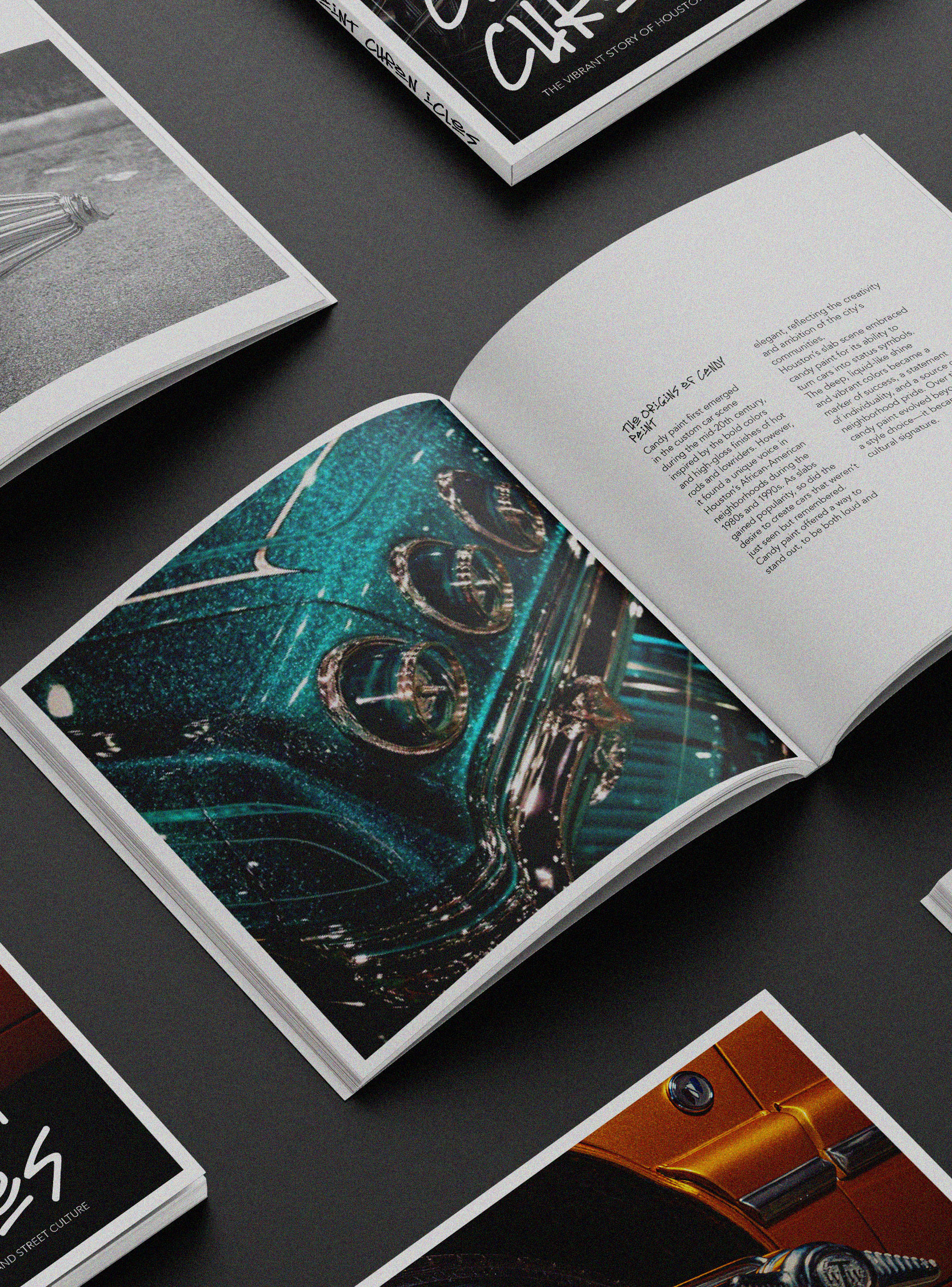
Origin of Death Wish
In an effort to stand out more prominently on the shelves, Death Wish Coffee has undertaken a bold rebranding initiative.
As an organic coffee company, Death Wish needed a fresh look that not only embodied the powerful and energetic essence of their product but also resonated with their target market of coffee enthusiasts who seek a stronger cup of joe.
The Challenge: A Brand in Need of Recognition
Before the rebranding, Death Wish Coffee had a loyal, niche following but struggled with wider brand recognition.
With a growing market of organic coffee brands, it became essential for Death Wish to establish a more visually arresting presence.
While their products were high quality, the old logo and packaging lacked the eye catching playfulness necessary to grab the attention of new customers. This was the catalyst for the major redesign.

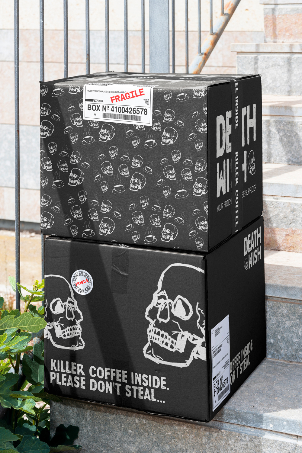
Old Design
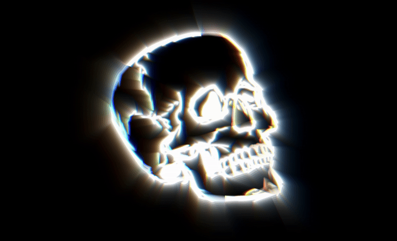
The original design uses a circular logo featuring a skull with crossbones in a relatively rigid and formal arrangement. It gives a nod to pirate and danger symbols, which aligns well with the "strongest coffee" concept.
The font used is clean and bold, but it feels more traditional, with straight lines and a serious tone.

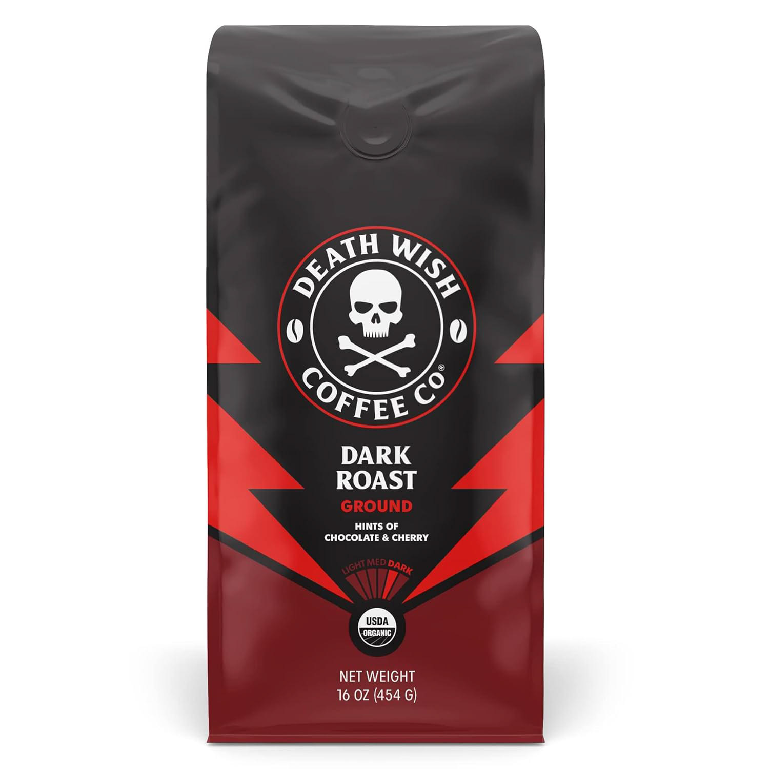
New Design
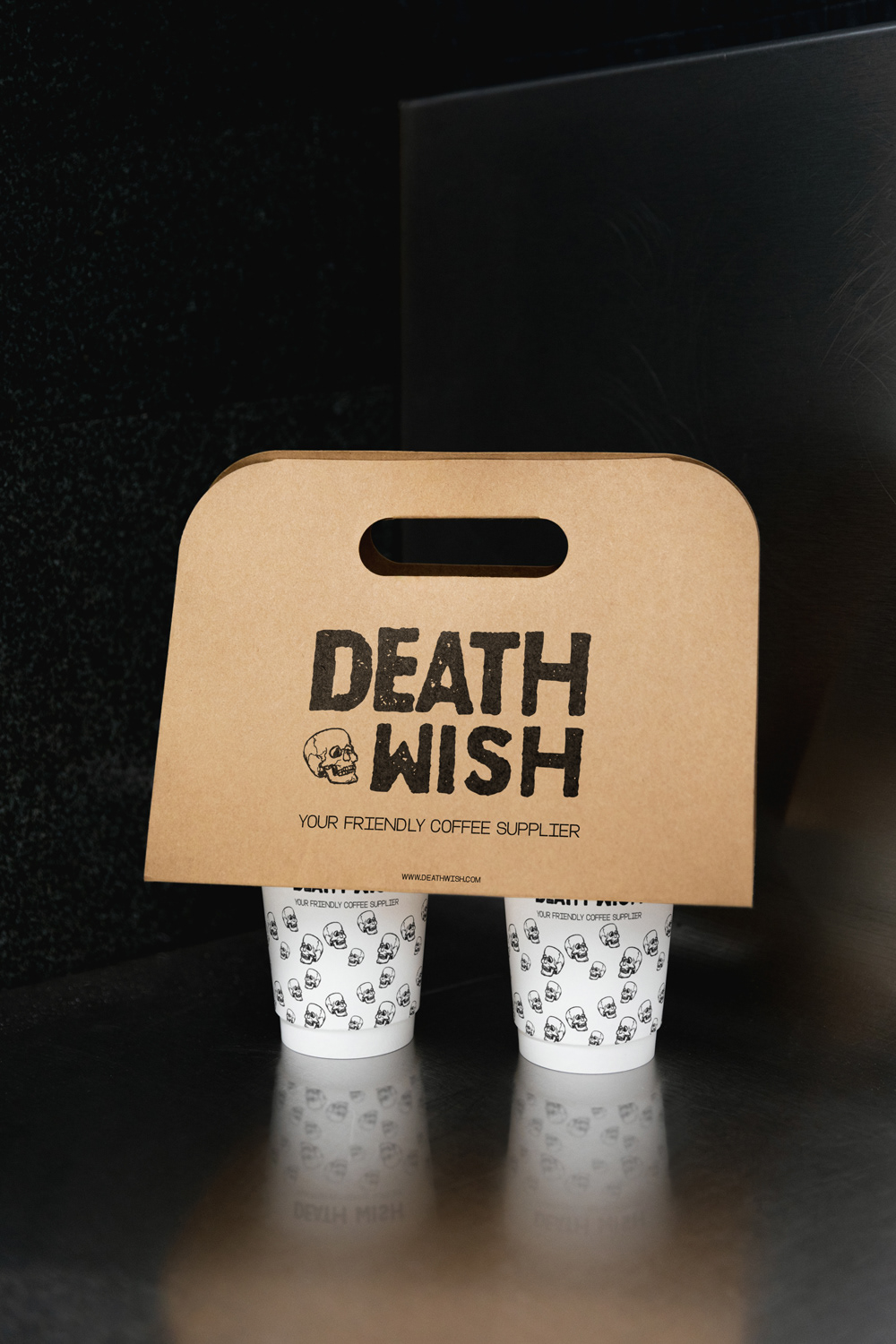
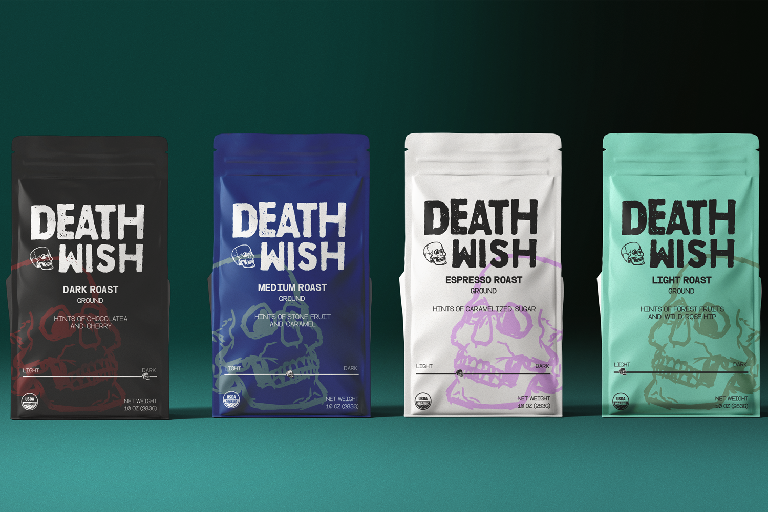
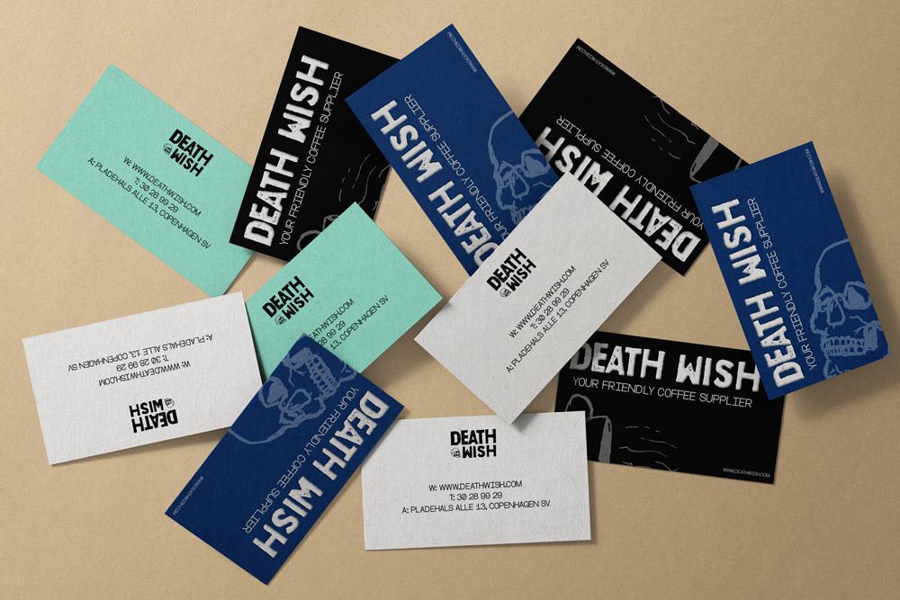
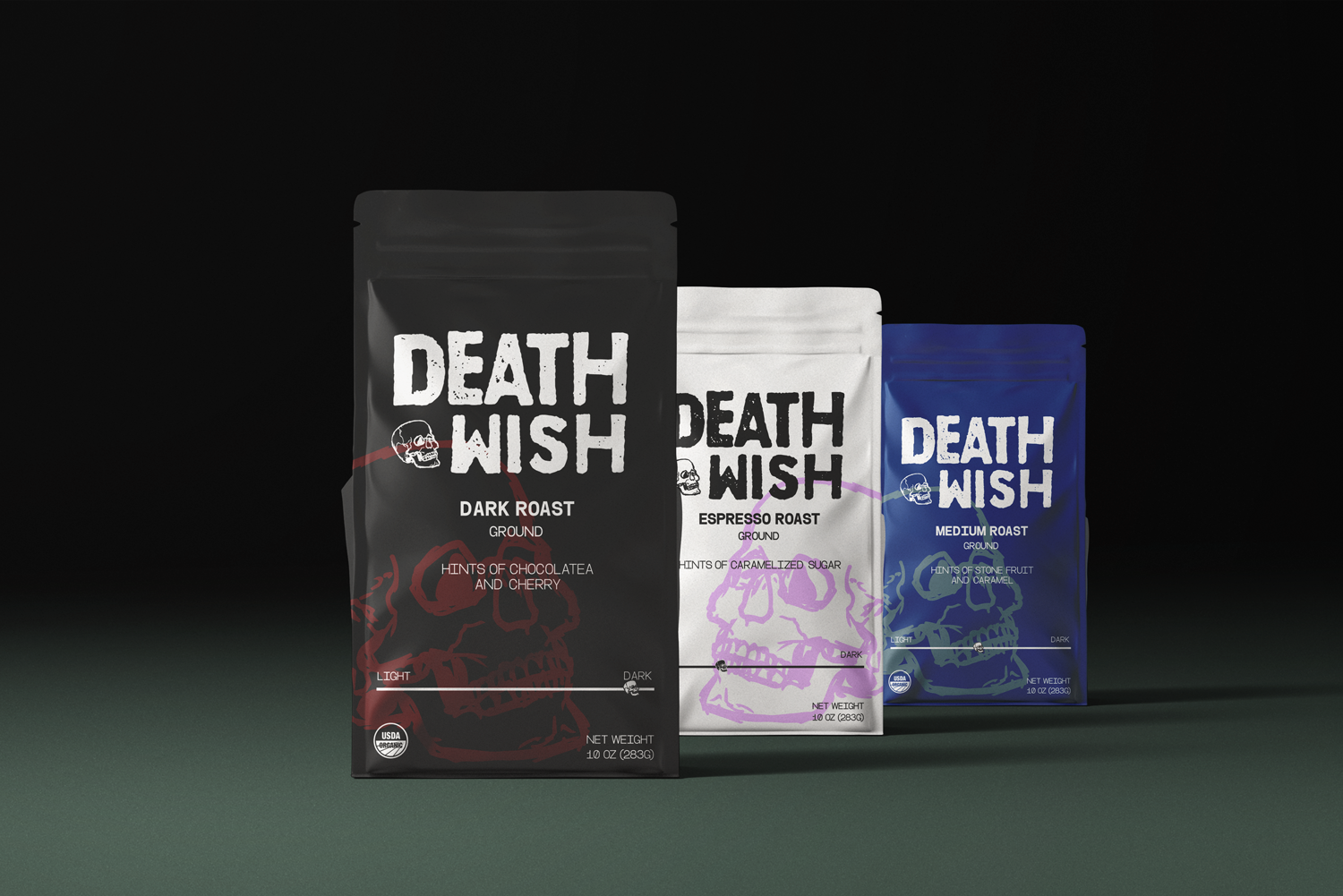
The new logo features a more playful skull mascot, which has a more cartoon-like, less formal appearance. This shift reflects a broader appeal and feels more approachable compared to the old logo.
The font is also more handwritten and informal, which ties into a sense of rebelliousness and personality but adds a touch of fun rather than sternness.
The overall aesthetic is simplified, and the skull mascot now serves as a background element. The flavors and notes are more prominent, making it easier for the consumer to identify the type of coffee and its characteristics at a glance.
Instead of leaning heavily into intensity, the new design balances this with a touch of playfulness while maintaining a certain degree of boldness.