Approach & Design Process:
While working as an Art Director at CO/Plus, I led the design direction, focusing on:
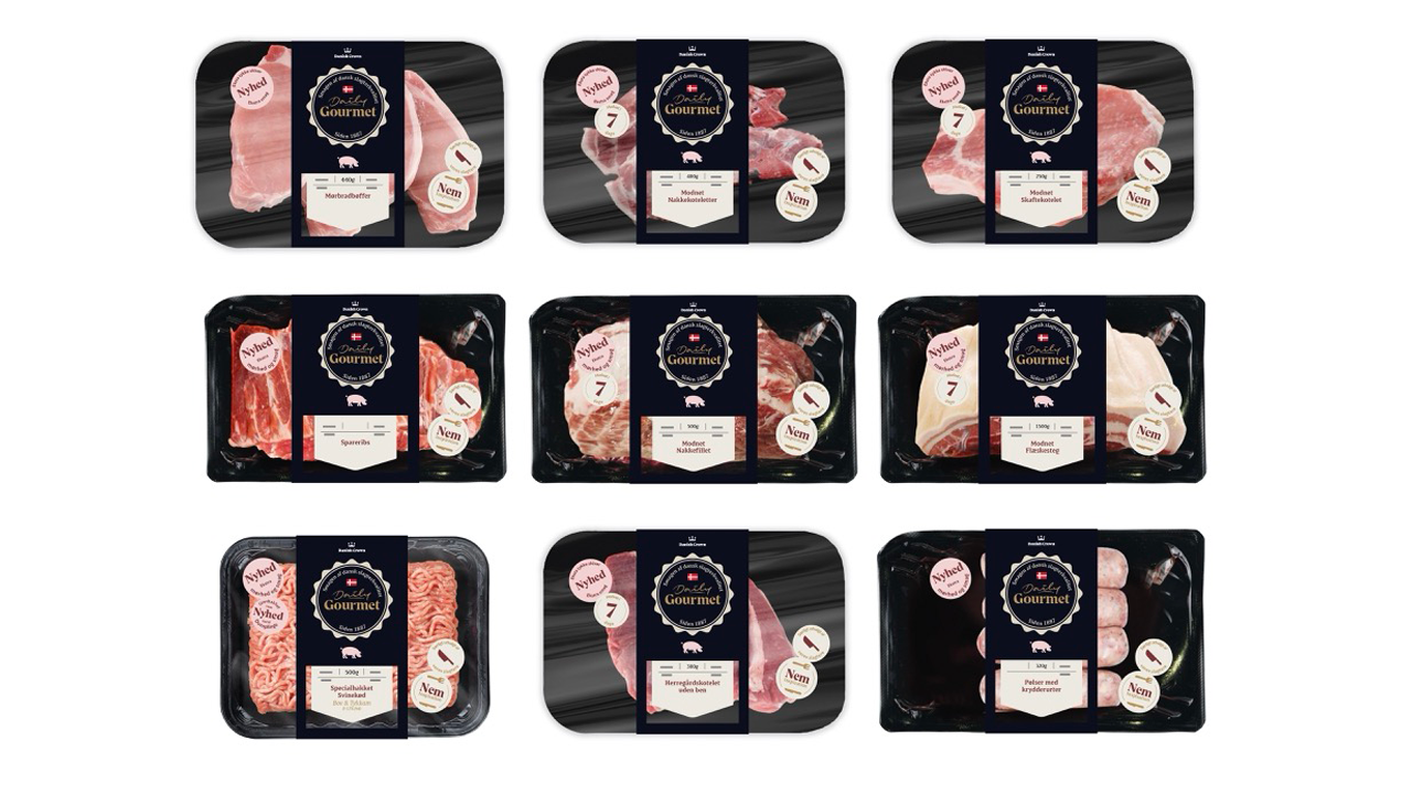
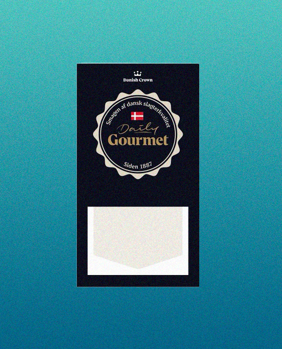
Premium Aesthetic: A dark, sophisticated background combined with gold-accented typography created a high-end feel.
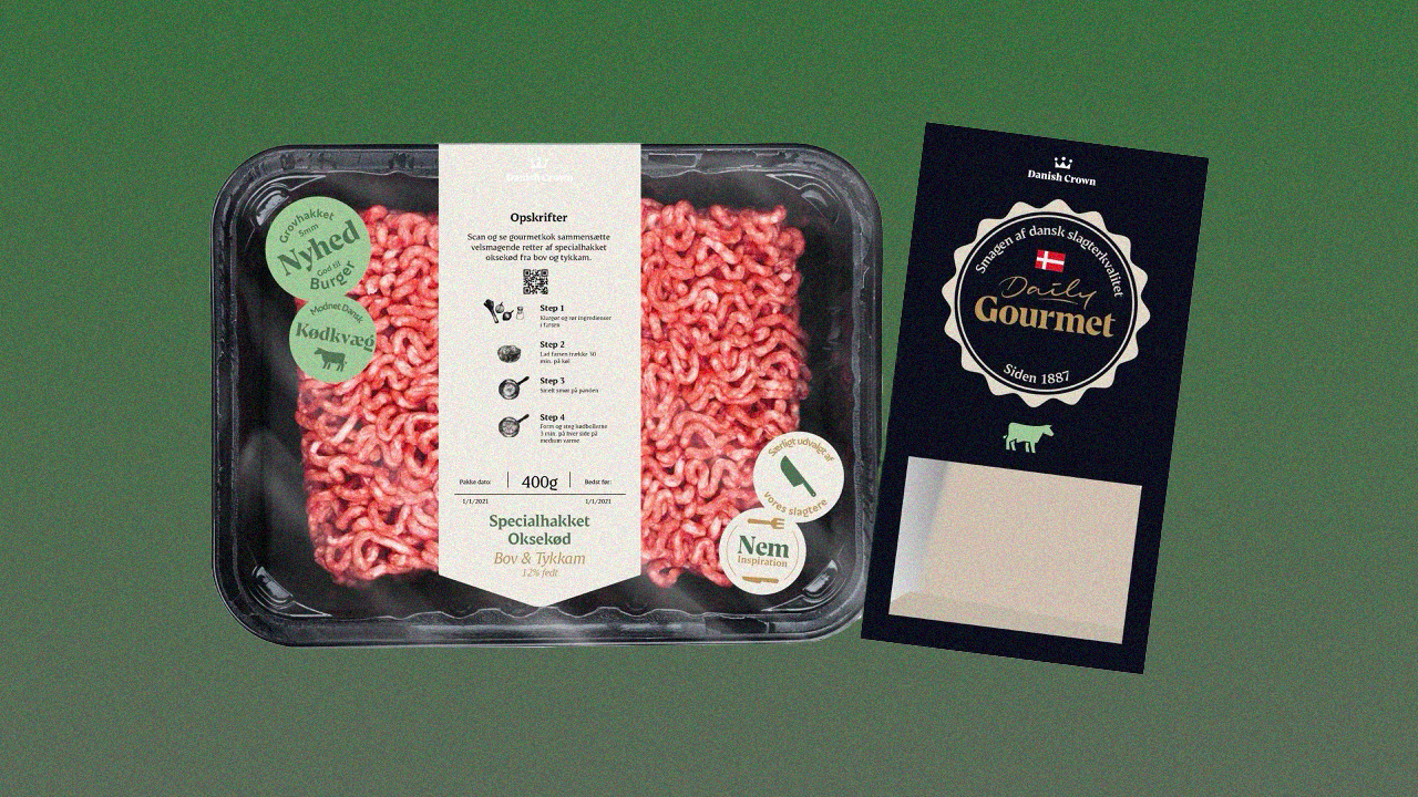
Clear Labeling & Storytelling: Consumers needed to quickly identify cuts, origin, and preparation ease. I designed intuitive icons and labels, ensuring clarity.
Brand Heritage: The Daily Gourmet crest reinforced Danish Crown’s long-standing tradition in quality meat production.
Material Considerations: We balanced visual appeal with packaging functionality, ensuring it remained durable and visually striking on shelves.

Design Strategy & Approach
1. Premium Visual Identity
To convey the gourmet nature of the product, we chose:
A dark, rich color palette (black and deep charcoal) to create contrast and a sense of exclusivity.
Gold-accented typography to enhance the premium feel without overpowering the design.
A structured layout that emphasized product quality while remaining visually clean.
2. Storytelling Through Packaging
Consumers buy with their eyes, so we ensured the packaging:
Highlighted the product itself with clear windows and minimal distractions.
Used intuitive labeling to communicate cut, origin, and preparation ease.
Featured a crest-style brand mark, reinforcing Danish Crown’s heritage while modernizing its appeal.
3. Balancing Tradition & Modernity
Danish Crown has a rich history, but Daily Gourmet needed a fresh, contemporary feel. We:
Integrated classic typography with modern design elements to reflect both legacy and innovation.
Used subtle textures and foiling techniques to create a tactile experience for customers.
Designed packaging that feels luxurious in hand, ensuring an immediate sense of quality.
4. Material Considerations
Beyond aesthetics, packaging had to be functional and sustainable.
We worked closely with production teams to:
Select eco-friendly yet durable materials, reducing environmental impact.
Ensure printing techniques maintained vibrancy and clarity even on darker backgrounds.
Test the design under retail conditions to guarantee shelf impact and readability.