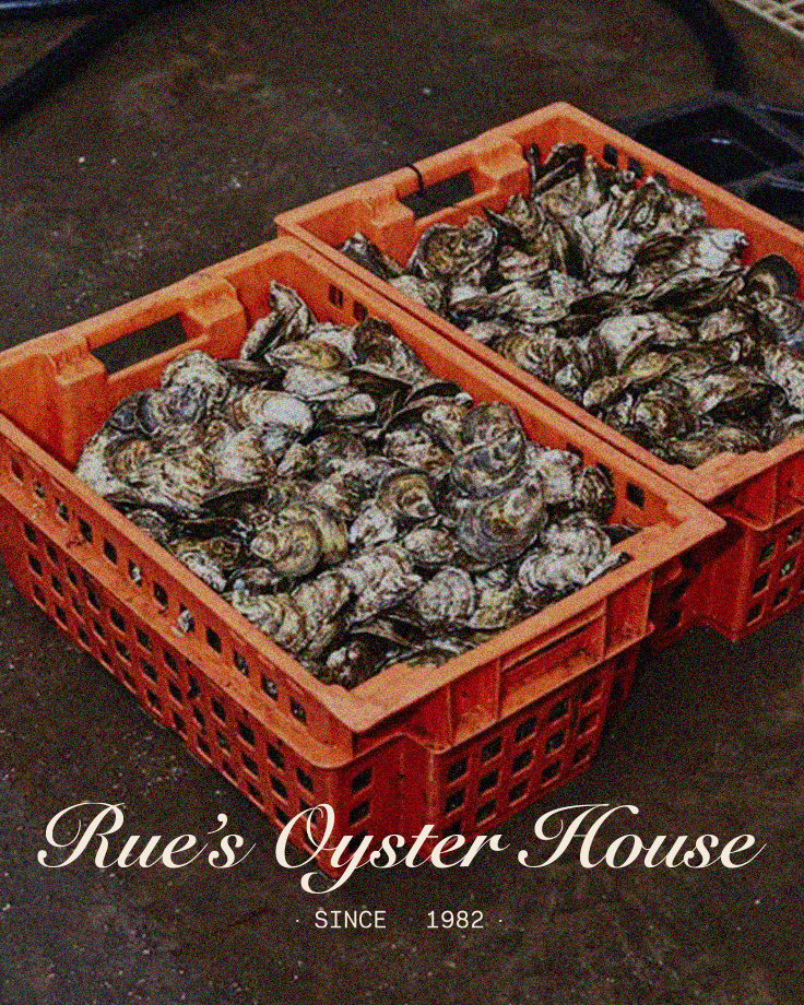
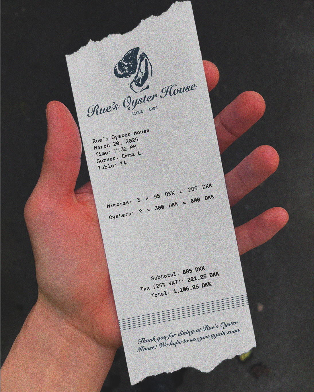
The Visual Identity
I wanted Rue’s Oyster House to feel like a place with a rich history, evoking the honoured tradition of oyster harvesting. The logo features a refined yet classic script, paying homage to maritime signage and handwritten menus found in old seafood shacks. A muted colour palette, inspired by seafoam, sand, and weathered driftwood, reinforces the connection to the ocean and the Danish coastline.
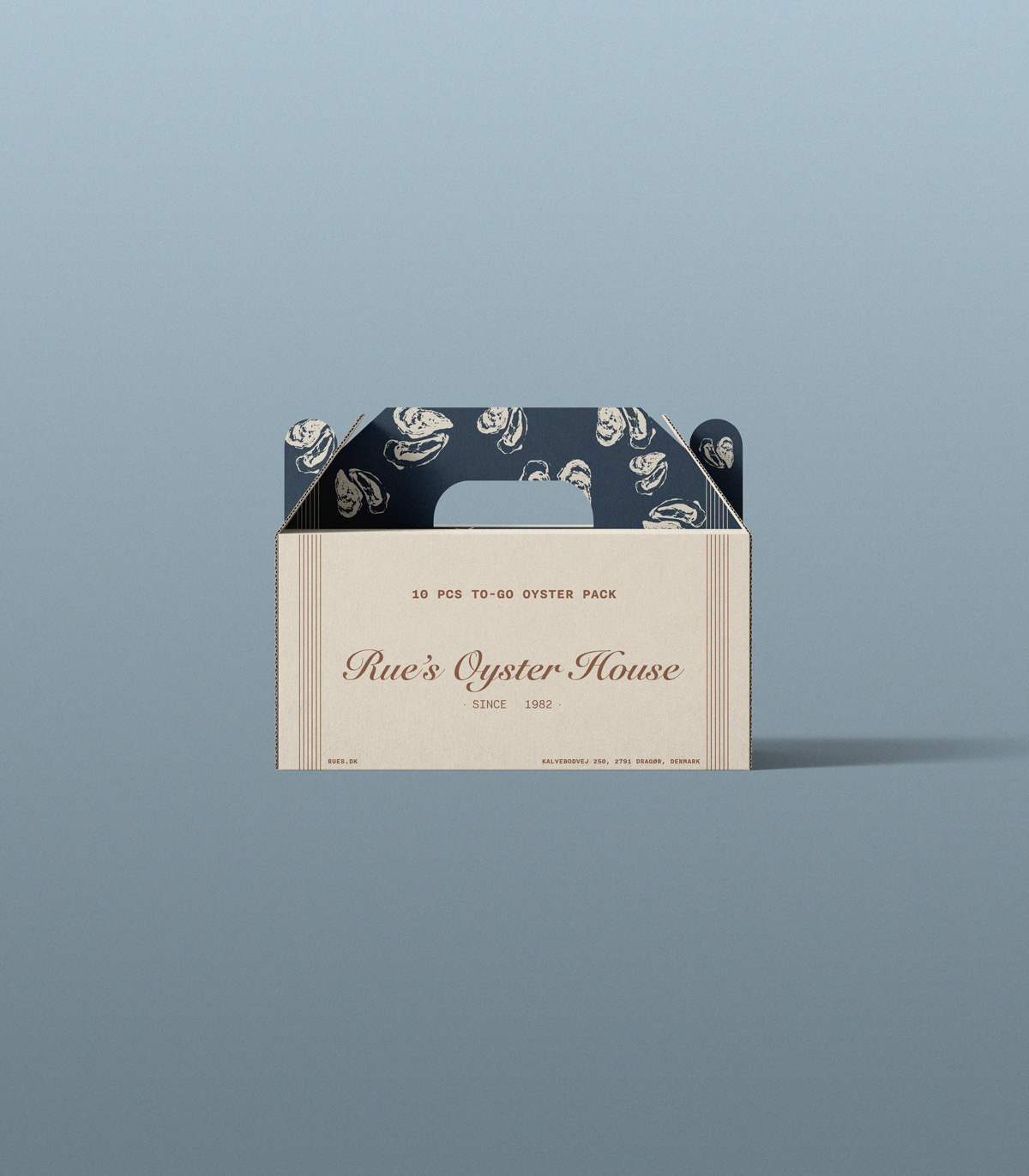
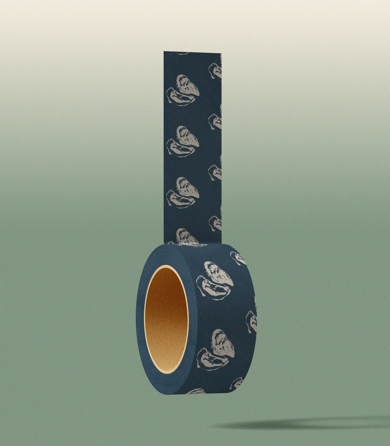
Packaging Design
With sustainability in mind, I designed a to-go oyster pack that feels as premium as the product itself. The carton is both minimal and elegant, featuring delicate oyster illustrations against a navy and cream backdrop. This packaging not only protects the oysters but also serves as a storytelling element, reinforcing Rue’s as a purveyor of the finest shellfish.
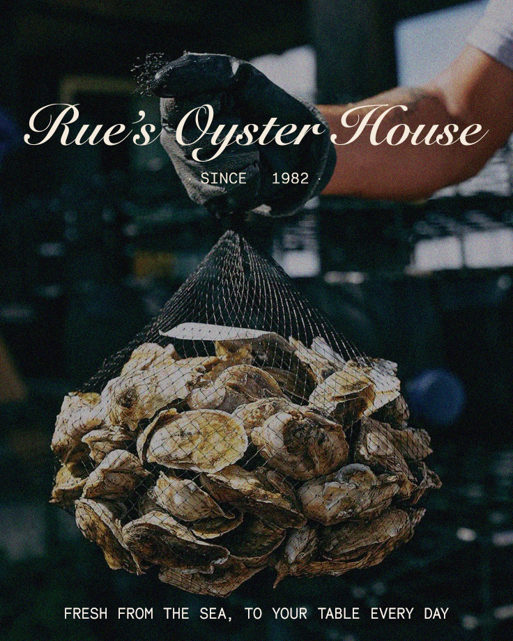
Tagline & Messaging
The tagline, Fresh from the sea, to your table every day, encapsulates Rue’s Oyster House’s commitment to quality and daily-limited harvests. The messaging across all brand touchpoints remains warm and inviting, ensuring customers feel the connection to the sea and the careful selection of each oyster.
Final Thoughts
Branding Rue’s Oyster House was about balancing heritage with a modern touch—creating an identity that feels timeless yet fresh. Every element, from typography to packaging, works in harmony to tell the story of a small but mighty oyster shack in Dragør.