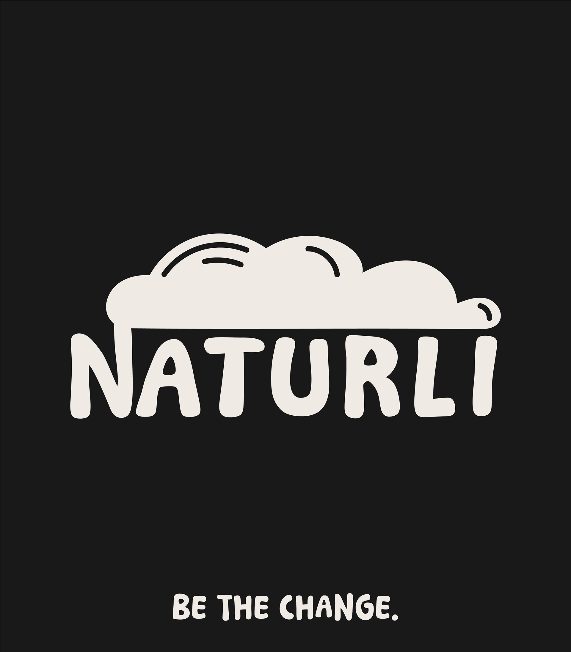

Bold by Nature: The Story Behind Naturli’s Packaging Redesign
Naturli is a brand that doesn’t blend in—it stands out. When designing the packaging for its range of plant-based products, we focused on creating something bold, organic, and unmistakably Naturli.
Key Points:
– The need to stand out in a crowded market
– How bold colors and hand-drawn elements make an impact
– The balance between playfulness and trustworthiness in design
Key Points:
– The need to stand out in a crowded market
– How bold colors and hand-drawn elements make an impact
– The balance between playfulness and trustworthiness in design
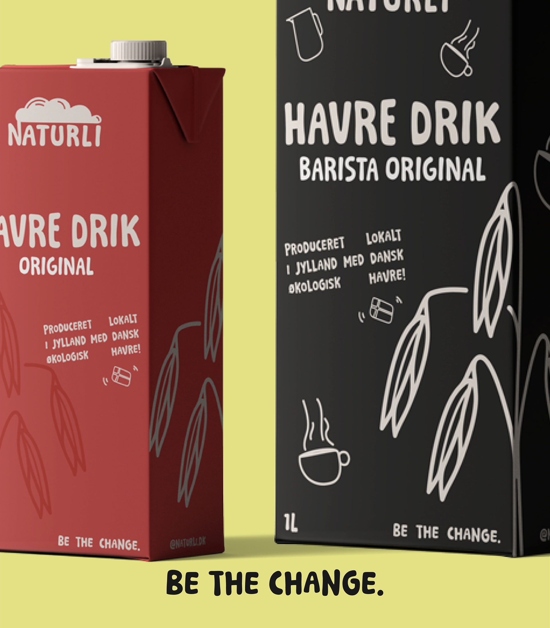
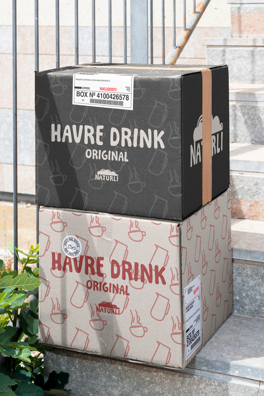
Breaking the Mold: How Naturli’s Packaging Disrupts the Shelf
Most plant-based brands lean into soft, minimalist aesthetics—but Naturli took a different route.
The goal? To create packaging that speaks loudly and proudly, making plant-based choices feel exciting and rebellious.
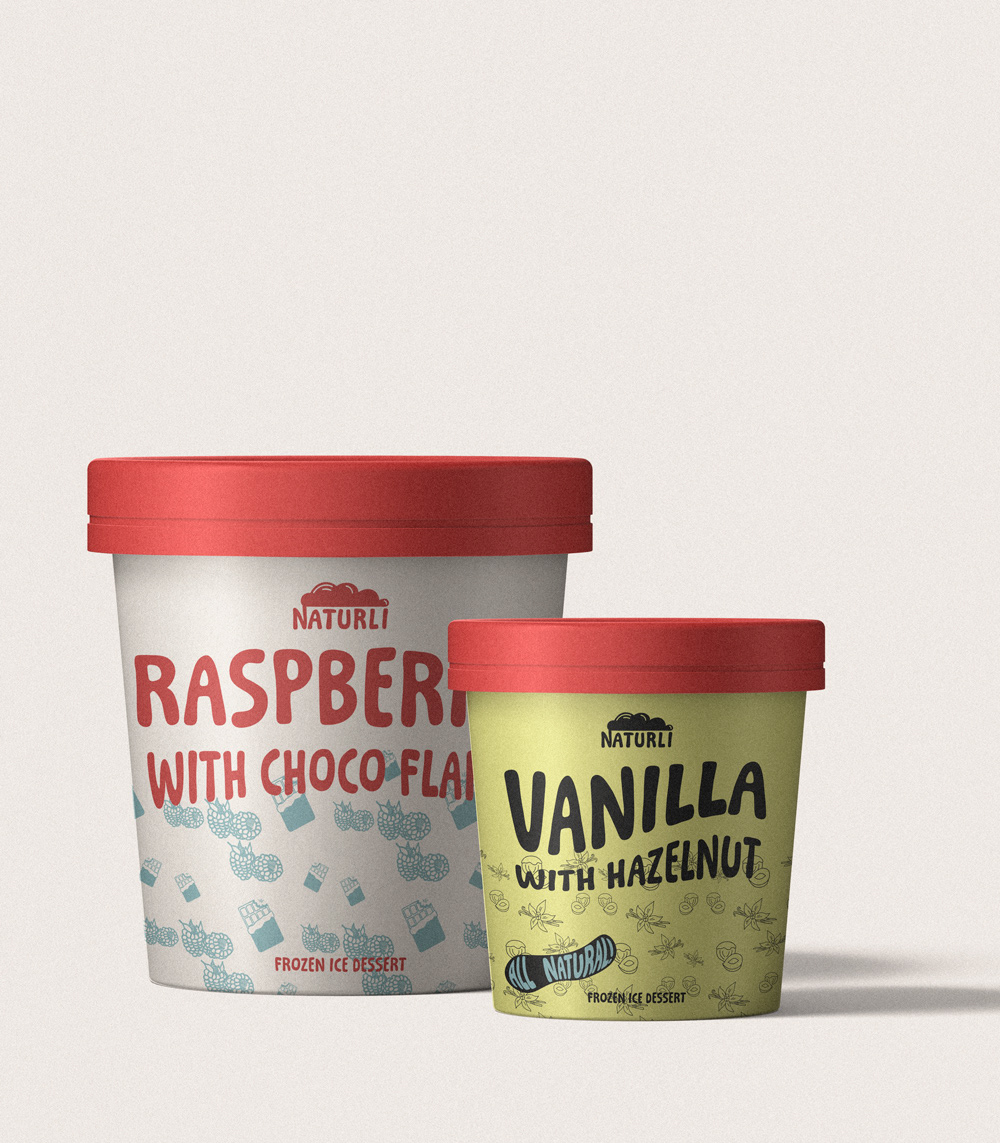
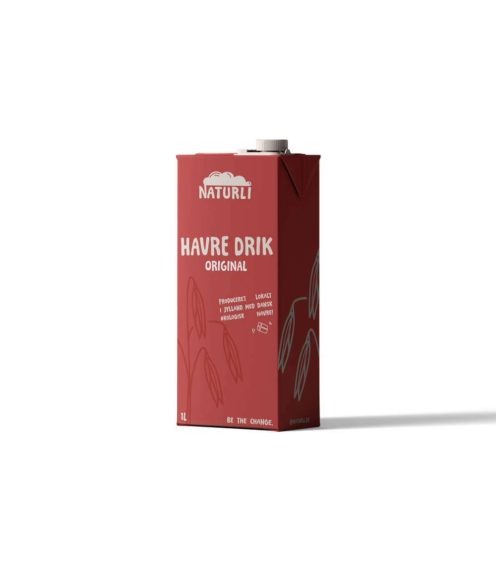
Naturli’s new packaging started as a vision to make plant-based products feel as bold as the change they represent. But how do you turn that into a visual language?
Process Breakdown:
– Research & Strategy – Understanding Naturli’s audience and competitors
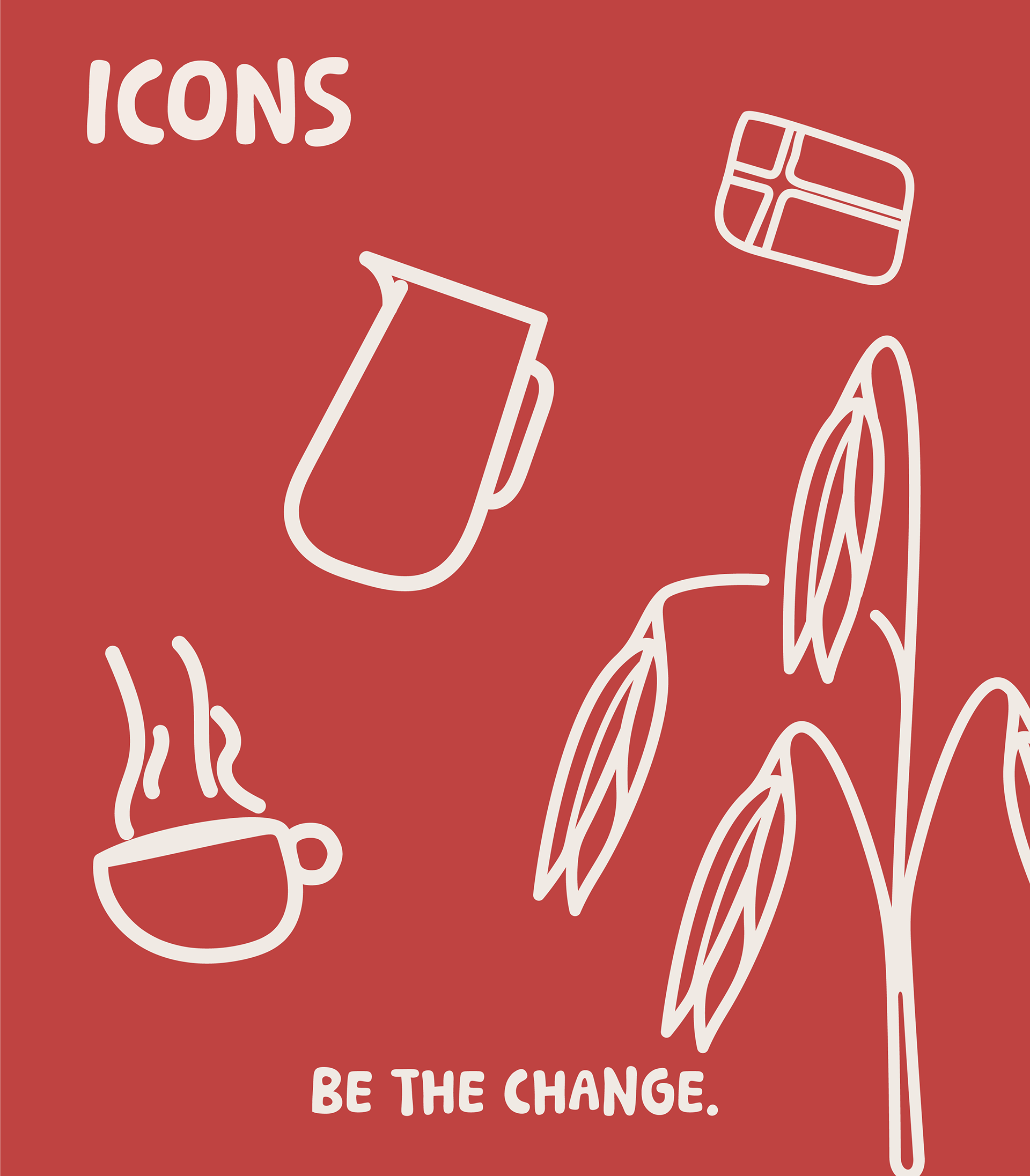
– Sketching & Prototyping – Testing hand-drawn elements and layouts
– Refinement & Execution – Choosing final color palettes, typography, and finishing touches
Process Breakdown:
– Research & Strategy – Understanding Naturli’s audience and competitors
– Sketching & Prototyping – Testing hand-drawn elements and layouts
– Refinement & Execution – Choosing final color palettes, typography, and finishing touches
Conclusion:Every detail in Naturli’s packaging is intentional. From organic patterns to vibrant colors, it’s a blend of strategy and creativity designed to make an impact.