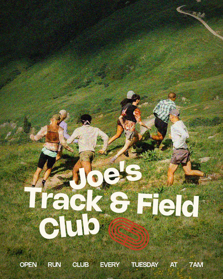
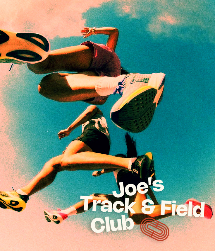
The branding plays with contrast: high-shine chrome against grainy textures, nostalgic track references paired with a sharp, modern type system. The custom logotype and track-inspired icon bring a tactile sense of speed and grit, while the campaign posters reflect the lived-in energy of the club—sun-drenched trails, city tracks, and real runners at every pace.
This project spanned logo design, art direction, and campaign rollouts, with a visual system built to flex across digital, print, and merch. Every detail was made to resonate with both serious runners and new joiners—welcoming, raw, and unmistakably Joe’s.
Logo System & Typography
The primary logotype is custom-built, inspired by 70s athletic typography with a modernized, geometric twist.
I introduced a chrome version of the logo as a nod to speed, shine, and performance culture—rendered with 3D treatments and lens flares to elevate the otherwise utilitarian lettering.
A secondary icon, a stylized link shaped like a running track, adds flexibility across applications. It represents both motion and unity, and doubles as a standalone mark for merch, social, and apparel.

